Plotting
Plotting
navis lets you plot neurons in 2d using matplotlib (nice for figures), and in 3d using either plotly when in a notebook environment like Deepnote or using a vispy-based 3D viewer when using a Python terminal. The vispy solution won’t work in Deepnote so we will focus on matplotlib’s 2d and plotly for 3d.
import navis

# This is relevant because Deepnote does not (yet) support fancy progress bars
navis.set_pbars(jupyter=False)

# Load one of the example neurons shipped with navis
n = navis.example_neurons(1, kind='skeleton')
WARNING: Could not load OpenGL library.
# Make a 2d plot
fig, ax = navis.plot2d(n)

# Note that this is equivalent to
# fig, ax = n.plot2d()
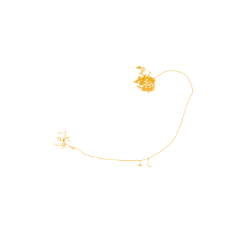
If you have seen an olfactory projection neuron before, you might have noticed that this neuron is upside-down. That’s because hemibrain neurons have an odd orienation in that the anterior-posterior axis not the z- but the y-axis (they have been image from above).
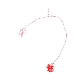
For us that just means we have to turn the camera ourselves if we want a frontal view:
# Make a 2d plot
fig, ax = navis.plot2d(n)

# Change camera (azimuth + elevation)
ax.azim, ax.elev = -90, -90

Let’s do the same in 3d:
# Get a list of neurons
nl = navis.example_neurons(5)

# Plot
navis.plot3d(nl, width=1000)
Navigation:
- left click and drag to rotate (select “Orbital rotation” above the legend to make your life easier)
- mousewheel to zoom
- middle-mouse + drag to translate
- click legend items (single or double) to hide/unhide
Above plots are very basic examples but there are a ton of ways to tweak things to your liking. For a full list of parameters check out the docs for plot2d and plot3d.
Let’s for example change the colors. In general, colors can be:
- a string - e.g.
"red"or just"r" - an rgb/rgba tuple - e.g.
(1, 0, 0)for red
# Plot all neurons in red
fig, ax = navis.plot2d(n, color='r')
ax.azim, ax.elev = -90, -90
# Plot all neurons in red (color as tuple)
fig, ax = navis.plot2d(n, color=(1, 0, 0, 1))
ax.azim, ax.elev = -90, -90

When plotting multiple neurons you can either use:
- a single color (
"r"or(1, 0, 0)) -> assigned to all neurons - a list of colors (
['r', 'yellow', (0, 0, 1)]) with a color for each neuron - a dictionary mapping neuron IDs to colors (
{1734350788: 'r', 1734350908: (1, 0, 1)}) - the name of a
matplotliborseaborncolor palette
# Plot with a specific color palette
navis.plot3d(nl, color='jet')
Exercises:
- Assign rainbow colors -
"red","orange","yellow","green"and"blue"- as list - Use a dictionary to make neurons
1734350788and1734350908green, and neurons722817260,754534424and754538881red
Volumes
plot2d and plot3d also let you plot meshes. Internally these are represented as navis.Volumes (a subclass of trimesh.Trimesh):
# navis ships with a neuropil volume (in hemibrain space)
vol = navis.example_volume('neuropil')
vol
<navis.Volume(name=neuropil, color=(0.85, 0.85, 0.85, 0.2), vertices.shape=(8997, 3), faces.shape=(18000, 3))>
To plot, simply pass it to the respective plotting function:
navis.plot3d([nl, vol])
Under the hood, Volumes are treated a bit differently from neurons. So if you want to change the color, you need to do so on the object:
# Give the neuropil a reddish color
vol.color = (1, .8, .8, .4)

navis.plot3d([nl, vol], width=800)
Scatter plots
Because scatter plots are a common way of visualizing 3D data, both plot2d and plot3d provide a quick interface: (N, 3) numpy arrays and pandas.DataFrames with x, y, and z columns are interpreted as data for a scatter plot:
# Get all branch points from the node table
bp = n.branch_points
bp.head()
| node_id | label | x | y | z | radius | parent_id | type | |
|---|---|---|---|---|---|---|---|---|
| 5 | 6 | 5 | 15678.400391 | 37086.300781 | 28349.400391 | 48.011600 | 5 | branch |
| 8 | 9 | 5 | 15159.400391 | 36641.500000 | 28392.900391 | 231.296997 | 8 | branch |
| 9 | 10 | 5 | 15144.000000 | 36710.000000 | 28142.000000 | 186.977005 | 9 | branch |
| 10 | 11 | 5 | 15246.400391 | 36812.398438 | 28005.500000 | 104.261002 | 10 | branch |
| 11 | 12 | 5 | 15284.000000 | 36850.000000 | 27882.000000 | 53.245602 | 11 | branch |
# Since `bp` contains x/y/z columns, we can pass it directly to the plotting functions
navis.plot3d([n, bp],
             c='k',  # make the neuron black
             scatter_kws=dict(color='r')  # make the markers red
             )
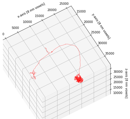
Fine-tuning figures
plot2d and plot3d provide a high-level interface to get your neurons on/in a matplotlib or a plotly figure, respectively. You can always use lower-level matplotlib/plotly interfaces directly to add more data or manipulate the figure. Just a cheap example:
# Plot neuron on a matplotlib figure
fig, ax = navis.plot2d(n, color='r')

# Show the neuron at a slight angle
ax.azim, ax.elev = -60, -60

# Zoom out a bit more
ax.dist = 8  # default is 7

# Unhide axes
ax.set_axis_on()

# Label the axes
ax.set_xlabel('x-axis [8 nm voxels]')
ax.set_ylabel('y-axis [8 nm voxels]')
ax.set_zlabel('z-axis [8 nm voxels]')
Text(0.5, 0, 'z-axis [8 nm voxels]')
This concludes this brief introduction to plotting but just to note that plot2d and plot3d have a lot of additional functionality to customize the way neurons are plotted. If you have time on your hands, I recommend you check out and play around with the available parameters (e.g. linewidth, color_by, shade_by, linestyle).
Feedback
Was this page helpful?
Glad to hear it! Please tell us how we can improve.
Sorry to hear that. Please tell us how we can improve.